Here are some of the fonts I found. I used the programme ISSUU to upload the the images of the text.
Friday, 7 October 2011
Planning for the front cover: Fonts.
I knew that looking at font would be difficult and would be a long process as there are so many that I could use for my local newspaper. Yet I know I can't just choose the first font I see, I will have to look into great depth at the font and then decide which one shall look best for the Haverhill Weekly Gazette.
Here are some of the fonts I found. I used the programme ISSUU to upload the the images of the text.
Here are some of the fonts I found. I used the programme ISSUU to upload the the images of the text.
Thursday, 6 October 2011
Final decision for the colour pallet for the Haverhill Weekly Gazette.
To help me decide what colour pallet to use for the Haverhill Weekly Gazette I decided to ask a range of people, aged between 19 - 30 - our target audience, to decide on what colour pallet they found was appropriate. To retrieve the data we used the sheet with all the choices of our colour pallets and surveyed 25 people asking them what three colour pallet would they prefer to see in their local newspaper. The results came back with 19 people preferring black, grey and red.
I think that this decision is a suitable for the Haverhill Weekly Gazette as these colours are very appealing and draw in the attention of others.
I think that this decision is a suitable for the Haverhill Weekly Gazette as these colours are very appealing and draw in the attention of others.
Planning for the front cover: Research into the three colour pallet scheme.
Last year, when taking AS media, I completed research into a music magazines. When doing this I found out about the use of three colour pallets and how every magazine uses a three colour pallet. When I done more research into the three colour pallet I then applied it to my music magazine. I then used the scheme for the front page, contents and double page spread of my music magazine.
When I began the research into newspapers, both national and local, I found out that they both use colour pallets of three. I knew I would have to apply a three colour pallet to the Haverhill Weekly Gazette so I then went and done research into my local newspapers to help me see what colours they use for their local newspapers and then come up with a range of colour pallets for the Haverhill WeeklyGazette and then choose the one which I think is most acceptable for my local newspaper.
Local newspapers three colour pallet:
Haverhill Weekly News - black, grey and blue
Haverhill Echo - black, white and red
Sudbury Mercury - Black, blue and yellow
Cambridge Evening News - black, blue and red
Cambridge First - black, white and blue
Cambridge Weekly News - black, blue and yellow
Bury Free Press - black, blue and yellow
Bury Journal - black, blue and yellow
Bury Mercury - black, blue and orange
Bury Times - black, blue and red
Here are some colour examples of three colour pallet that we may use for the Haverhill Weekly Gazette.

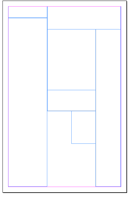
Layout of Haverhill Weekly News made on Indesign.
Introduction: Using our previous drafts of the layouts that we had created by hand drawing and then going onto create a computered layout on Word. We used both of these layouts to help us create our final layout draft on Indesign. We decided to use Indesign to create the local newspaper because we had all had a little bit of experience using it but wanted to gain more knowledge.
Front Page.

Using Indesign we were able to create the final layout. Creating the layout on Indesign we were then able to include our text and images that will then contribute to the final copy.
The Inside Page.
Planning for the front cover: Creating a name of my local newspaper.
When creating the name of the local newspaper we had to work as a group and agree on something we thought was the most suitable. We found the key thing with deciding on the name of the local newspaper was noting down a variety of names and then choosing the one that will suit our newspaper the best.
I also researched, online, the names of local newspapers to set me in the right direction. From my research I found out that each weekly local newspaper included 'weekly' in their masthead to indicate to the readers that it is a weekly local newspaper. I also found out that each local newspaper included the name of their town/village/city and this tended to be at the beginning of the masthead.
Here are some of the ideas we came up with:
Haverhill Weekly Sunday,
Haverhill Weekly Times,
Haverhill Weekly Deliver,
Haverhill Weekly Journal,
Haverhill Weekly Gazette,
Haverhill Weekly Telegraph,
Haverhill Weekly Express,
Haverhill Weekly Press.
From all of this choices we came down to three choices, which were: 'Haverhill Weekly Journal, 'Haverhill Weekly Gazette' and 'Haverhill Weekly Press'. After trying out the each masthead on our layouts we came to a decision to use 'Haverhill Weekly Gazette'.
Wednesday, 5 October 2011
Computerised Layouts
Firstly I completed a drawn layout for the front cover and the inside page however the drawn layouts were a very rough guide that were just to indicate to me what layout I was going to use for the Haverhill Weekly Gazette. I did not think this layout was acceptable to use a a proper guide because it was hand drawn and not very accurate. Therefore I then went onto complete a computerised layout to help me achieve the accuracy.


Front Cover

Inside Cover

Final decision of the inside page of the local newspaper.

Instead of deciding ourselves we decided to ask our target audience, people aged 19 - 30, to choose what layout they would prefer to see on the inside colour of their local newspaper. After getting the results back from the 25 people we asked 13 people decided that this one was more appropriate. I think that there decision was sensible as I find it aesthetically pleasing and is suitable for the Haverhill Weekly Gazette.
Planning for the front cover: My drafts for the inside page of a local newspaper.


I have also done a range of inside page layouts to, again, give me a choice of the layout I am going to choose.
Planning for the front cover: Decision of the layout.
As a group we had to decide on a layout together. In the end we decided on:

We choose this layout as it is simple and it shall grab the audience's attention, therefore making them want to read their local newspaper. I contributed to choosing this layout as I found on my survey monkey this layout was the most similar layout, that people thought was very acceptable for their local newspaper layout.
I will now go onto filling in the gaps of the local newspaper we my ideas and for my own issue.
Planning for the front cover: My drafts for the front page of a local newspaper.


I have drafted these layouts, based upon my local newspaper layouts to give me a variety of choice and choose the best layout for my local newspaper.
Results - Analysing them from my survey.
When looking into my results I could then go onto create the front page of my local newspaper
My results show me that people would:
- Rather receive a free local paper (60%),
- Prefer a weekly local newspaper (76.7%),
- Like to see local events and articles based around local experiences (46%),
- Think it is acceptable if my layout was similar to Haverhill Weekly News (73.3%),
- Like to see local business's being advertised (96.7%),
- Prefer to see a mixture of both articles and images on the front cover of my local newspaper (73.3%).
Subscribe to:
Comments (Atom)