Monday 12 December 2011

Planning for the front cover: What's on my front page of the Haverhill Weekly Gazette.

Main article:
- Samuel Ward Academy contributes to charity.

Main image:
- Samuel Ward students.


Front page advertisement:
- Jewel Mark Jewellers.


Kicker 1:
- Homes for sale.

Kicker 1 image:
- House with selling post.

Kicker:
- Soldiers home safe from the war.

Kicker 2 image:
- Solider reunited with his family.

Inside contents:


Type of font:
- Masthead -  Bell MT
- Copy - Franklin Gothic Book
Three colour pallet scheme: black, grey and red
My issue date: Friday 9th December 2011
Website: www.haverhillweeklygazette.co.uk
Price: 35 pence

Friday 18 November 2011

Survey results for font copy.

Here are the results from our survey, you can see that Franklin Gothic Book was selected for the font that looks the most professional, Euphemia UCAS was the majority vote for the easiest font to read and the last question showed results that Franklin Gothic Book was the font that our audience would like to read in their local newspaper. Like the other survey we asked if they would like to see the font round or blocked in their local newspaper and if block or rounded grabbed their attention first, both response came back with block font being the most popular. 
Therefore from this feedback we are going to use Franklin Gothic Book text for the copy. Using block, lower case letters to make the font easy to read. 

Fonts for the copy.

Like the fonts for the masthead and article titles we are doing the same type of thing, by choosing six fonts that we think are suitable for the copy and then create a survey and ask 25 people who are our demographic audience and ask them five questions and then go for the majority vote and then choose the font which they would most like to see in their local newspaper.

Thursday 17 November 2011

Survey results from Masthead and Article title fonts.

Here are the survey responses that we collected from 25 people within our target audience age range. You can see that our target attentions attention was grabbed from the font perpetua, although the same people thought that Bell MT was the most suitable font for their local newspaper. Even though the perpetua font was attention grabbing our responses from our audience thought that Bell MT was more attractive, with eleven out of twenty-five voted. Therefore we knew that we were going to be using Bell MT for the Haverhill Weekly Gazette yet we did not know that if we were going to use the font in italics or bold. We asked this question in our survey and the results came back with eighteen people choosing bold. In our survey we also asked if our target audience would prefer to see the font for the masthead and article titles in upper case, or lower case, the majority vote came out to be that they preferred upper case. 

Fonts for the Masthead and Article titles.


Even though I had already completed some research into the use of fonts within local newspapers. I had collected the fonts off the internet and therefore could not use them in the Haverhill Weekly Gazette as I was using the programmes Photoshop and Indesign, where these fonts were not available. As a group we went through some of the fonts available on both programmes. We knew that we were going to have two different types of fonts for the masthead and article titles and different font of the copy. We thought it was suitable to go through these two programmes as a group and decide what eight fonts we thought were appropriate for the masthead and article titles. We then decided to create a survey and ask our target audience what font they thought suitable for the Haverhill Weekly Gazette. 

Wednesday 2 November 2011

Creating the front page of the Haverhill Gazette.

After completing all of my research I shall now go on to creating the front page of the local newspaper. I understand that to achieve a good front page of the local newspaper you need to be organised and it shall take a lot of drafts and planning. Therefore I shall use my time planning sheet, that I created at the start of the course, as a guide to follow to help me achieve the best I can.

Friday 7 October 2011

Planning for the front cover: Fonts.

I knew that looking at font would be difficult and would be a long process as there are so many that I could use for my local newspaper. Yet I know I can't just choose the first font I see, I will have to look into great depth at the font and then decide which one shall look best for the Haverhill Weekly Gazette.
Here are some of the fonts I found. I used the programme ISSUU to upload the the images of the text.

Thursday 6 October 2011

Final decision for the colour pallet for the Haverhill Weekly Gazette.

To help me decide what colour pallet to use for the Haverhill Weekly Gazette I decided to ask a range of people, aged between 19 - 30 - our target audience, to decide on what colour pallet they found was appropriate. To retrieve the data we used the sheet with all the choices of our colour pallets and surveyed 25 people asking them what three colour pallet would they prefer to see in their local newspaper. The results came back with 19 people preferring black, grey and red.
I think that this decision is a suitable for the Haverhill Weekly Gazette as these colours are very appealing and draw in the attention of others.

Planning for the front cover: Research into the three colour pallet scheme.

Last year, when taking AS media, I completed research into a music magazines. When doing this I found out about the use of three colour pallets and how every magazine uses a three colour pallet. When I done more research into the three colour pallet I then applied it to my music magazine. I then used the scheme for the front page, contents and double page spread of my music magazine.
When I began the research into newspapers, both national and local, I found out that they both use colour pallets of three. I knew I would have to apply a three colour pallet to the Haverhill Weekly Gazette so I then went and done research into my local newspapers to help me see what colours they use for their local newspapers and then come up with a range of colour pallets for the Haverhill WeeklyGazette and then choose the one which I think is most acceptable for my local newspaper.
Local newspapers three colour pallet:
Haverhill Weekly News - black, grey and blue
Haverhill Echo - black, white and red
Sudbury Mercury - Black, blue and yellow
Cambridge Evening News - black, blue and red
Cambridge First - black, white and blue
Cambridge Weekly News - black, blue and yellow
Bury Free Press - black, blue and yellow
Bury Journal - black, blue and yellow
Bury Mercury - black, blue and orange
Bury Times - black, blue and red

Here are some colour examples of three colour pallet that we may use for the Haverhill Weekly Gazette.

Layout of Haverhill Weekly News made on Indesign.

Introduction: Using our previous drafts of the layouts that we had created by hand drawing and then going onto create a computered layout on Word. We used both of these layouts to help us create our final  layout draft on Indesign. We decided to use Indesign to create the local newspaper because we had all had a little bit of experience using it but wanted to gain more knowledge. 

Front Page.


Using Indesign we were able to create the final layout. Creating the layout on Indesign we were then able to include our text and images that will then contribute to the final copy. 


The Inside Page.  

Again like the front page, we were using Indesign to make the final draft of the layout and by using indesign it was easily accessible to edit.

Planning for the front cover: Creating a name of my local newspaper.

When creating the name of the local newspaper we had to work as a group and agree on something we thought was the most suitable. We found the key thing with deciding on the name of the local newspaper was noting down a variety of names and then choosing the one that will suit our newspaper the best.
I also researched, online, the names of local newspapers to set me in the right direction. From my research I found out that each weekly local newspaper included 'weekly' in their masthead to indicate to the readers that it is a weekly local newspaper. I also found out that each local newspaper included the name of their town/village/city and this tended to be at the beginning of the masthead.
Here are some of the ideas we came up with:
Haverhill Weekly Sunday,
Haverhill Weekly Times,
Haverhill Weekly Deliver,
Haverhill Weekly Journal,
Haverhill Weekly Gazette,
Haverhill Weekly Telegraph,
Haverhill Weekly Express,
Haverhill Weekly Press.

From all of this choices we came down to three choices, which were: 'Haverhill Weekly Journal, 'Haverhill Weekly Gazette' and 'Haverhill Weekly Press'. After trying out the each masthead on our layouts we came to a decision to use 'Haverhill Weekly Gazette'.

Wednesday 5 October 2011

Computerised Layouts

Firstly I completed a drawn layout for the front cover and the inside page however the drawn layouts were a very rough guide that were just to indicate to me what layout I was going to use for the Haverhill Weekly Gazette. I did not think this layout was acceptable to use a a proper guide because it was hand drawn and not very accurate. Therefore I then went onto complete a computerised layout to help me achieve the accuracy.


Front Cover


Inside Cover


Final decision of the inside page of the local newspaper.


Instead of deciding ourselves we decided to ask our target audience, people aged 19 - 30, to choose what layout they would prefer to see on the inside colour of their local newspaper. After getting the results back from the 25 people we asked 13 people decided that this one was more appropriate. I think that there decision was sensible as I find it aesthetically pleasing and is suitable for the Haverhill Weekly Gazette.

Planning for the front cover: My drafts for the inside page of a local newspaper.


I have also done a range of inside page layouts to, again, give me a choice of the layout I am going to choose.

Planning for the front cover: Decision of the layout.


As a group we had to decide on a layout together. In the end we decided on: 


We choose this layout as it is simple and it shall grab the audience's attention, therefore making them want to read their local newspaper. I contributed to choosing this layout as I found on my survey monkey this layout was the most similar layout, that people thought was very acceptable for their local newspaper layout.

I will now go onto filling in the gaps of the local newspaper we my ideas and for my own issue. 

Planning for the front cover: My drafts for the front page of a local newspaper.


I have drafted these layouts, based upon my local newspaper layouts to give me a variety of choice and choose the best layout for my local newspaper. 

Results - Analysing them from my survey.

When looking into my results I could then go onto create the front page of my local newspaper
My results show me that people would:
- Rather receive a free local paper (60%),
- Prefer a weekly local newspaper (76.7%),
- Like to see local events and articles based around local experiences (46%),
- Think it is acceptable if my layout was similar to Haverhill Weekly News (73.3%),
-  Like to see local business's being advertised (96.7%),
- Prefer to see a mixture of both articles and images on the front cover of my local newspaper (73.3%).

Thursday 29 September 2011

Results - Analysing them from my survey.

From my survey monkey I was able to retrieve 30 responses. I asked 30 different people, aged between 19 - 30, as I found that the older generation were more likely to read and were interested in their local newspapers. I decided to ask 30, mixed gender, people to help me get enough information to calculate the average and then go into putting that data into a graph that could then help me to create the front page of my local newspaper.


Wednesday 28 September 2011

Survey Monkey questionnaire for a local newspaper.

I created a survey monkey account to have the opportunity to ask my intended audience, 19-30 year olds, questions on what they look for in their local paper, how often they read it, etc.
To view my questionnaire click on the link below:
http://www.surveymonkey.com/s/R2MD3ML

Tuesday 27 September 2011

Results on my target audience.

After doing a small survey, in my local high street, I was able to ask a range of ages if they read their local newspaper. I was able to ask a total of 25 people. As it was a small survey I was just recording my answers in a tally.
My survey consisted of the questions:
- Do you read your local newspaper?
(If they answered yes I would then go on to ask...)
Are you more likely to read Haverhill Weekly News (free local newspaper) or Haverhill Echo(paid local newspaper)?
I thought it was too personal and many people may get offended if I was to ask their age, therefore I had estimate their age. I created a tick box system that had the ages of: 18 and under, 19 - 30, 31 - 40, 41 - 50 and 51+.
I had asked a range of people, of different ages, due to my tally showing me that I had ticked a minimum of 2 people in each age box.
My results show me that the ages 19 - 30 read there local newspaper more than any other age. Therefore I know know that my intended audience is 19 - 30 and I shall try to make my local newspaper appeal to this age group.

Research into the target audience of a local newspaper.

Many people appeal to newspapers, it really does vary to a range of different people. Each individual reading their local newspaper for a different reason. The younger generation reading the newspaper, looking at the writing and looking for inspiration and the older generation looking at what is going on in their village/town/city. When creating my own local newspaper, I shall have to create a newspaper that appeals to a target audience. To help me retrieve my target audience I shall have to do a small survey, asking a range of ages, if they read there local newspaper.

Textual analysis of a front cover story - paragraph by paragraph

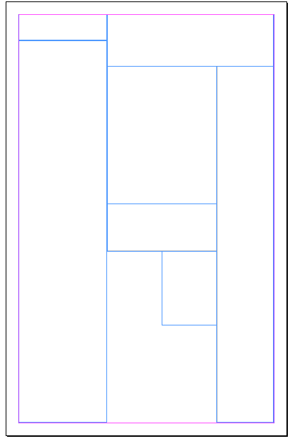
Paragraph by paragraph textual analysis of a front cover story from a local newspaper.

Here we have looked at a main story from the cover of  “The Haverhill Weekly” and looked paragraph-by-paragraph what a front cover story’s codes and conventions are and what is placed within each paragraph.

·      Paragraph 1: Sum- up of the story line

·      Paragraph 2: Who the story involves, where is occurs and what the events were.

·      Paragraph 3: Description of the person involved, ie, Name, age, where they live/ are from.

·      Paragraph 4: this paragraph includes quotes from whom the story involves, for example their take on the story.

·      Paragraph 5: this paragraph includes quotes from whom the story involves, for example their take on the story.

·      Paragraph 6: Description of other parties involved in  the story, i.e., Name, age, where they live/ from and their relationship to the story

·      Paragraph 7: This is where the narrative by the journalist begins to describe the story

·      Paragraph 8: this paragraph includes quotes from whom the story involves, for example their take on the story.

·      Paragraph 9: this paragraph includes quotes from whom the story involves, for example their take on the story.

·      Paragraph 10: Narrative by the journalist

·      Paragraph 11: Narrative by the journalist

·      Paragraph 12: Includes another quote from the parties involved in the story.

·      Paragraph 13: Often contains donation requests if the story is involved with some sort of charity or asking for help after personal disaster  (such as house fires)

·      Paragraph 14: Ends in a happier tone to contrast the story and to give an overall feel of wellbeing to the reader, for example this paragraph will explain how the parties involved are now getting on. 

Friday 23 September 2011

Difference between Tabloids and Broadsheets.

Broadsheet

The appearance of the broadsheet is more subtle than the tabloid. With the articles image being the main attraction to the newspaper. The image, that they have used is very specific, they have used a child who is surrounded by dead crops. With no family around, the child is just sitting next to a human skull. This suggests that the child is in desperate need of some help. The image leaves the reader guessing who's skull it is, could it be the child's mother? Are they all alone? What is going to happen to them?
The articles main headline isn't much bigger than the font however the number, in which the number of people who are at risk of war, poverty and hunger, however the number - that is related to the main headline is dramatically larger and in red. This is because the editor wants to shock its readers with drastic amount of people who are at risk. The colour red connotes death and automatically the reader knows the article is not positive from the colour of the headline.
The audience of the broadsheet is people who tend to be more upper class and more educated than the people who reader tabloids.This tends to be because of the use of the language used in the broadsheets. The language of a broadsheet is very formal, factual and broadsheets use written language and include a wide range of vocabulary. 
The structure of a broadsheet is very organised. Using their introduction paragraph to comment on who, what, where, when and why. Then going into more depth within the other paragraphs of the article. 


 Tabloid


The appearance of the tabloid is very bold compared to the tabloid. With the article headline being the main attraction of the front page of the tabloid. The masthead is bright and with images of celebrities surrounding it. The main headline is: 'Girl of 12 taken by pervert Marine'. Just this headline alone has taken up two thirds of the page with just the text of this headline. The text of the main headline is very different to the broadsheet as it is in bold and takes up so much room of the front page. Whereas the broadsheet concentrates it's front page on the article the tabloid focuses on the headline, trying to draw in readers. Even though this is the main headline there is a lot of attention focused on the other headline: 'Gareth confesses I did sleep with Jordan'. This is very normal of a tabloid to use celebrities on the front page cover of their newspaper as they know their audience. The editor of the Sun knows it's audience - it is people who are interested in celebrities lives therefore they take advantage of this, knowing what will draw in the attention of its readers.
The language of tabloids is very different from broadsheets because tabloids tend to use an informal style of writing and often appears as sensationalism. Tabloids use everyday lexis that comes into context with most people. The tabloids tend to use alliteration and often a pun to grab their readers attention and persuade them to purchase their newspaper.
The structure of a tabloids article.Tabloids use bits and pieces of articles to highlight the most shocking and scandalous parts to grab their readers attention.

The comparison of language between broadsheets, tabloids and local newsapapers.

Te definition of a newspaper is: a scheduled publication containing news of current events.
I have drawn up a small table to show the main differences between: tabloids, local newspapers and broadsheets.

Wednesday 21 September 2011

Time Planning Sheet for my Local Newspaper, Radio Advertising and Poster Advertisement.


Time planning sheet for a local newspaper.

1) Start my blog and begin research into the codes and conventions of a local newspaper. (12th - 22nd September)
2) Research into a what my local audience is going to be. Create a survey monkey questionnaire to find a target audience and information on what I want my local newspaper to include. (21st -27th September)
3) Design a rough layout of my local newspaper keep redrafting until I achieve the final layout (2nd - 5th October)
4) As a group decide on a name for the local newspaper. (5th - 6th October)
5) Decide on a colour pallet for our local newspaper. (6th - 8th October)
6) Look into the types of fonts that I may be able to use for my local newspaper. (10th October)
7) Decide on the contents of the articles and begin to take first draft images for the newspaper. If using a local business for my articles I need to get permission to take pictures of their property. (10th - 15th October)
8) Look on a range of different programmes and choose a few fonts that are appropriate for the newspaper and then create a questionnaire asking our target audience what their opinion is. (16th - 31st October)
9) Decide a electronic layout of the front page and the contents page on two different programmes. (1st - 20th November)
10) Create a first draft for the main article. (25th - 30th November)
11) Keep redrafting the main article copy (1st December - 5th December)
12) Once the final draft is produced for the main article start to begin to make the front page of the newspaper on Indesign. (5th December - 1st February)
13) Start creating the contents page of our local newspaper (5th February - 15th)

Thursday 15 September 2011

Looking at Local Newspapers.

When I found out I was going to create my own local newspaper I firstly started to look at the template of local newspapers to help me get a see at their layout. Which would then help me to create my own template for my local newspaper.
Here are some examples of local newspapers I was looking at:


Wednesday 14 September 2011

The beginning of it all.

At the beginning of my AS media course I had to create a music magazine. I worked with Lewis Parkinson and together we created two front covers, two contents pages and two double page spreads for the music magazine 'Euphonic'. I blogged all of my coursework onto Tumblr and here is the URL: http://jessgridleymedia.tumblr.com/
These were my final outcomes:


This year I am going to be working with Amber Benjamin and Naomi Craven. Out of all of the options we were given, for the media coursework, I was most interested in completing it on creating a front cover and the first inside page of a local newspaper. And for the advertisements we chose was to create a radio advert and a poster to promote our local newspaper. I found myself drawn to this piece of coursework from the start as I am currently taking English Language A2 and I am very interested in going into Journalism. My Media and English are going really well together and having an eye for non-fiction writing, therefore I think that I shall really enjoy this coursework and use my English skills to help write the local newspaper with a journalistic eye.